Hello all,
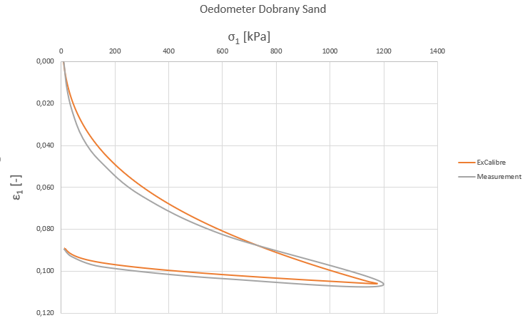
i hava a problem with the Oedometer curves after the automatic calibration with ExCalibre. I took the Dobrany sand dataset for an automatic calibration and then i copied the results of the Oedometer test into an Excel sheet. In the same Excel sheet i saved the measurement data of the dataset and plotted the Oedometer curve with Excel. The graph created with Excel is different to the graph of ExCalibre. What i also observed was, that for example the maximum strain for the Oedometer test of the measurement data is different to the maximum of the ExCalibre graph.
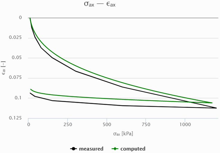
Both figures – oedometer curve Excel and oedometer curve ExCalibre- are attached.
Maybe anyone can tell me the reason for that?
Thanks in advance and best regards
Marco
Dear Marco,
I think this is because transforms laboratory data from engineering strain (Delta h/h0) to natural strain (dh/h). Please try to transform them in your spreadsheet to see whether you get the same results and let us know.
Regards David
Dear David,
maybe you can have a look on my new post which is about my last post some weeks ago. Thanks in advance.
Regards Marco